A Developer's Guide to Accidental Design Principles
Image Credit: NordWood Themes, Unsplash
As developers, we build things to be functional. But making them usable and clear is a different challenge. This post documents the design evolution of my personal website, and the key design principles I learned through the iterations.
Now I didn’t learn these principles while making the site themselves but in fact resonated with them after going throught the process myself first. I outline the laws in between the post content as I think they might be part of a reason that led me to keep making iterations…
Iteration 1: Pixels all the way
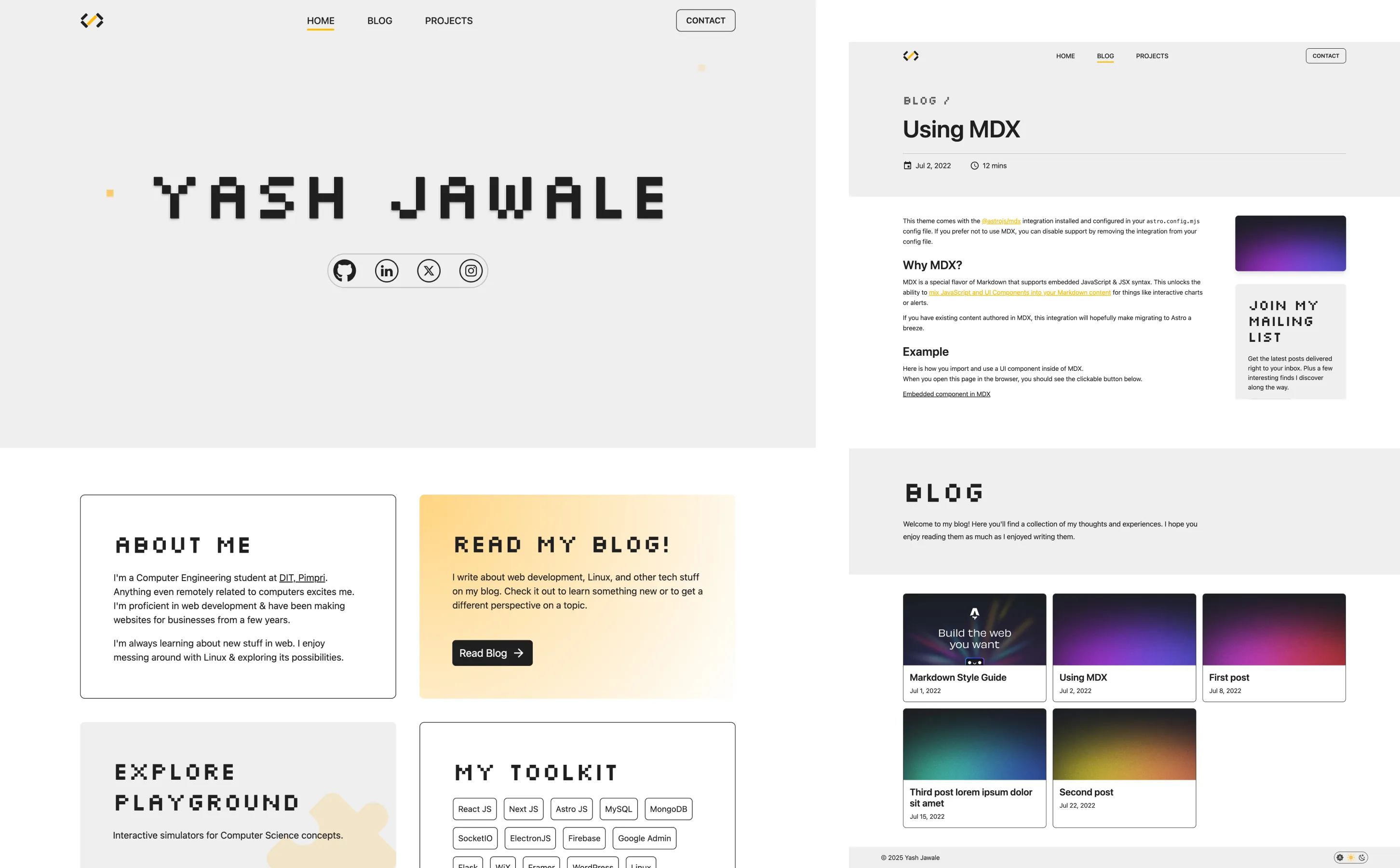
During the first time building the site (Around December of 2023), I wanted by site to have a unique character & coincidentally, I was quite intrigued by the Hyundai elevators installed in my college used a pixelated font. (Similar to Ioniq 5 of that time)
I wanted to have some part of that design in my site & stumbled upon the SilkScreen font for the same
Now this font wasn’t readable in small text so to balance its striking appearance, it was paired with Inter - a font similar to Helvetica Neue which was also quite popular at that time. Infact, even GNOME had changed its default system font from Cantarell to Inter around that time.
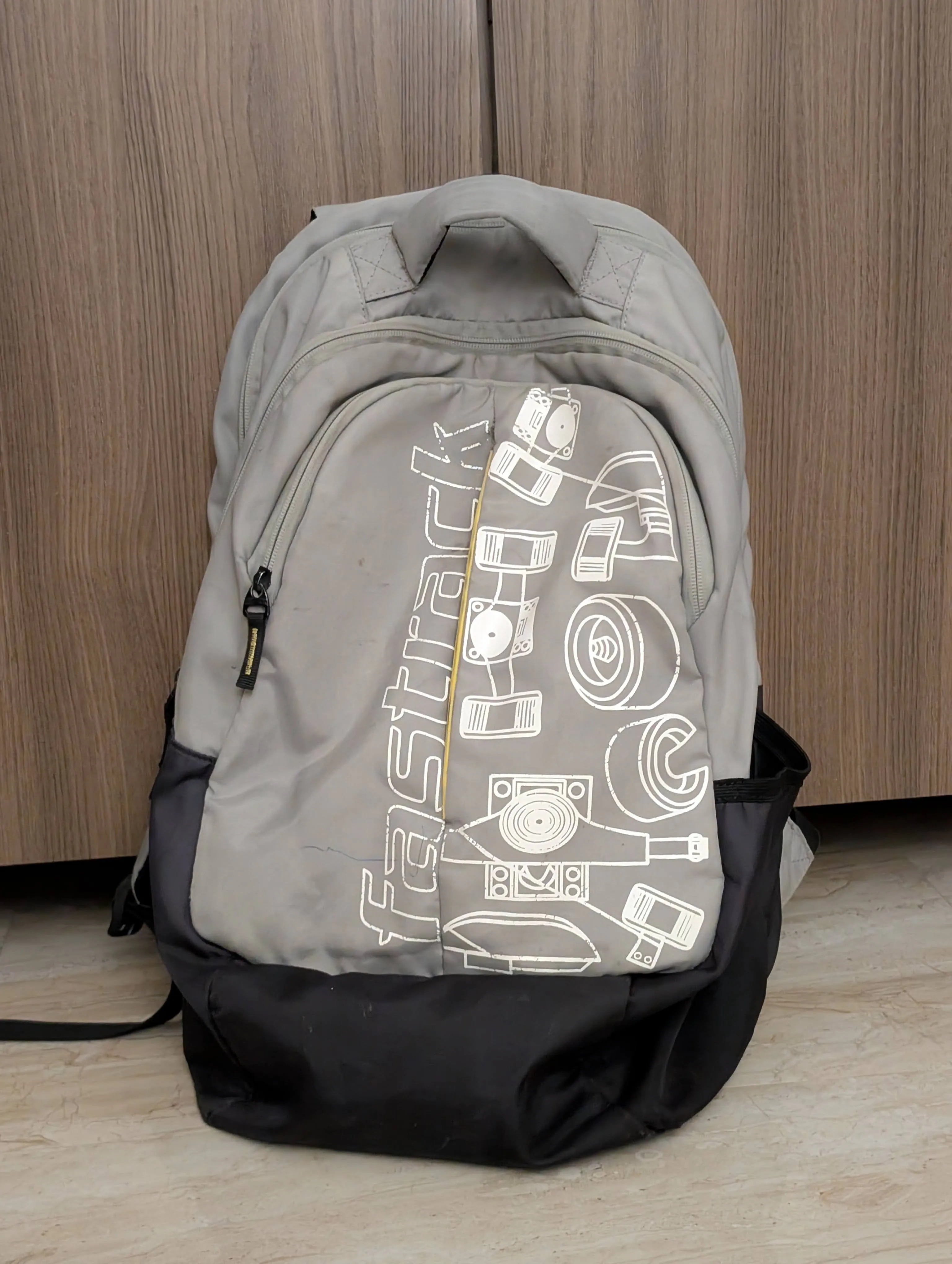
For the color scheme I decided to stick with grey/yellow pair as I always liked that combo & my backpack had that same color scheme 😝
At the time, I just knew the heading didn’t feel quite right, that it took a moment too long to read. It’s only now, while writing this post, that I’ve found the formal design principle that explains that friction…
Law of Prägnanz
Our brains prefer to interpret complex images as the simplest form possible.
A pixelated, complex heading requires more mental effort from the user to understand. The takeaway is that clarity should usually come before style.
Iteration 2: Plants & Cursive
While I was happy with the look of previous iteration, I never quite felt that it reflected me as a person. I wanted my site to have a friendly image & some connection to natural elements. I’m quite fond of plants & am still fascinated by them.
So the idea behind this was to bring in the plant elements & represent it with ASCII Art to bring in that “Developer Effect”. While working on that I had chosen a green theme & it reminded me a lot of monsoon season in India (Typically runs from about June to September, although Global Warming might disagree). That’s when it struck me that what if the art & color scheme changed according to the current season. Then this was made (Around September 2024).
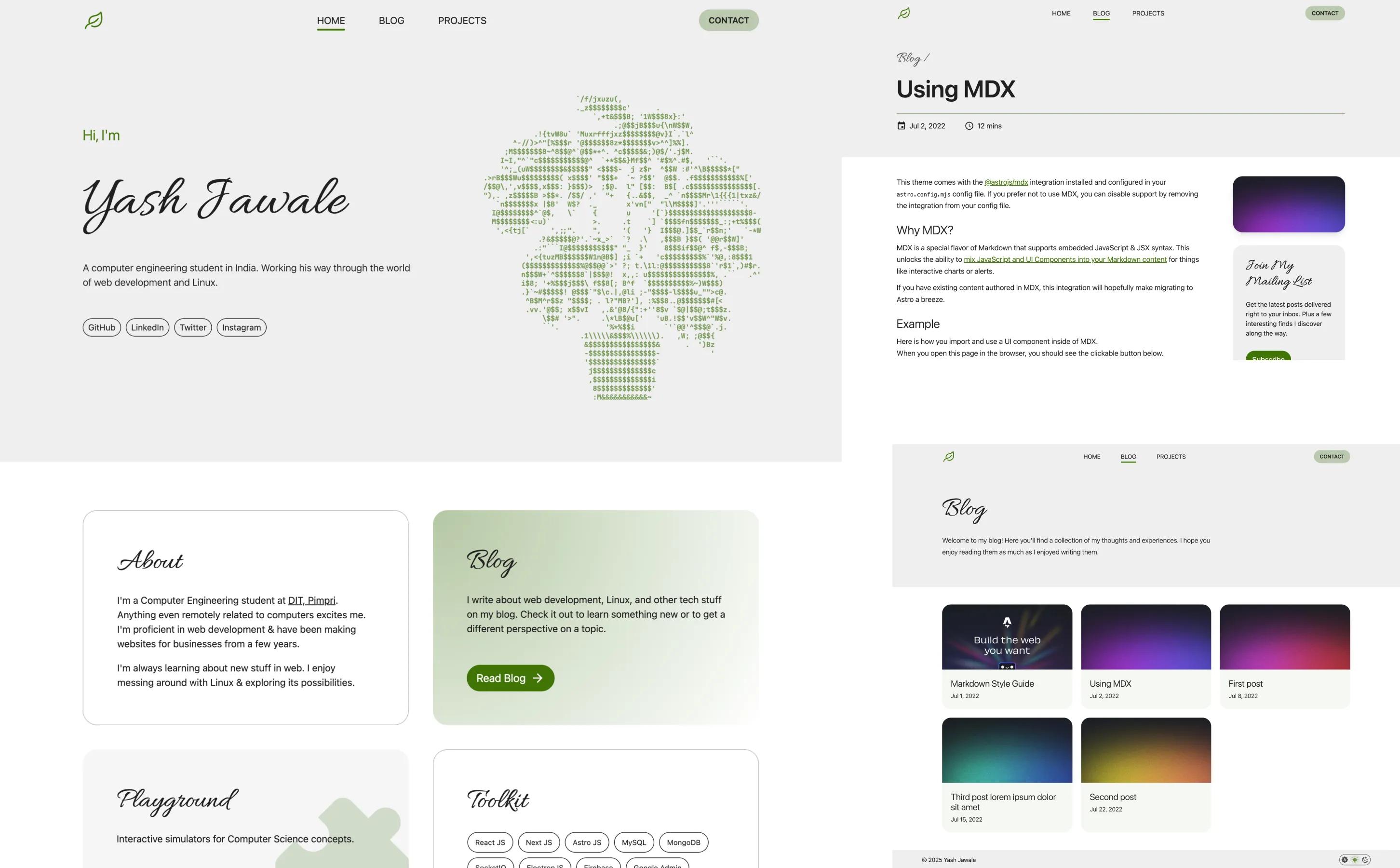
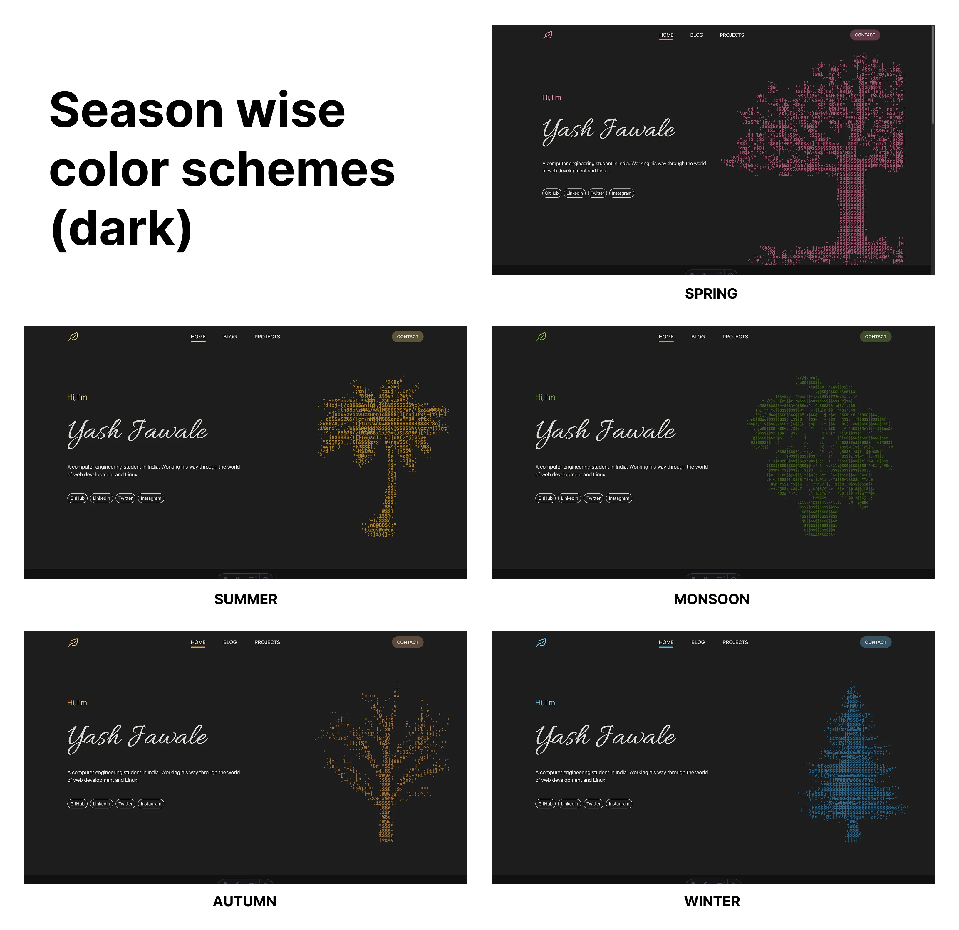
This one never went live as I got busy with work in internship at that time & when I finally found time to update the site after a few months, the design had lost its appeal in my mind for some reason…
Back then, my reason for abandoning this version was just a vague feeling that it had ‘lost its appeal’ and felt cluttered. Researching for this article, I can now put a name to that feeling, and it connects directly to how our brains group objects and digest information…
Law of Proximity
Objects placed close together are perceived as a group.
The cursive nature of heading fonts, the ASCII art on hero section might've created unintended groupings and visual clutter.
Chunking
It means breaking down content into smaller, digestible pieces (like paragraphs, cards, or lists) so users aren't overwhelmed.
The overly decorative style might've made it hard to break the content into logical chunks. This design made it hard to see where one chunk ended and another began.
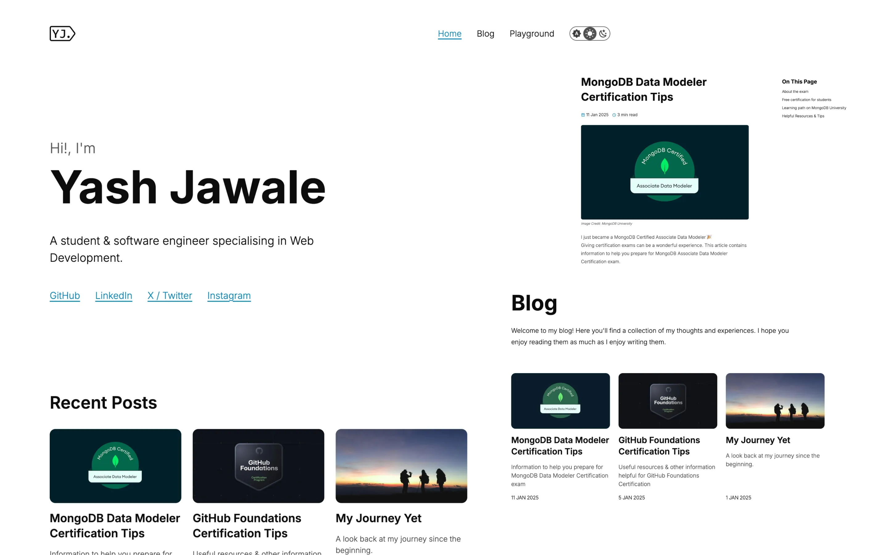
Iteration 3: Back to basics
By this time, I had realized that I’ve probably spent more time thinking about the design of my site than I ideally should & was determined to make a design that I won’t be compelled to change or losing resonance with me. This time I just wanted something simple which brought out the beauty of typography itself instead of additional design elements.
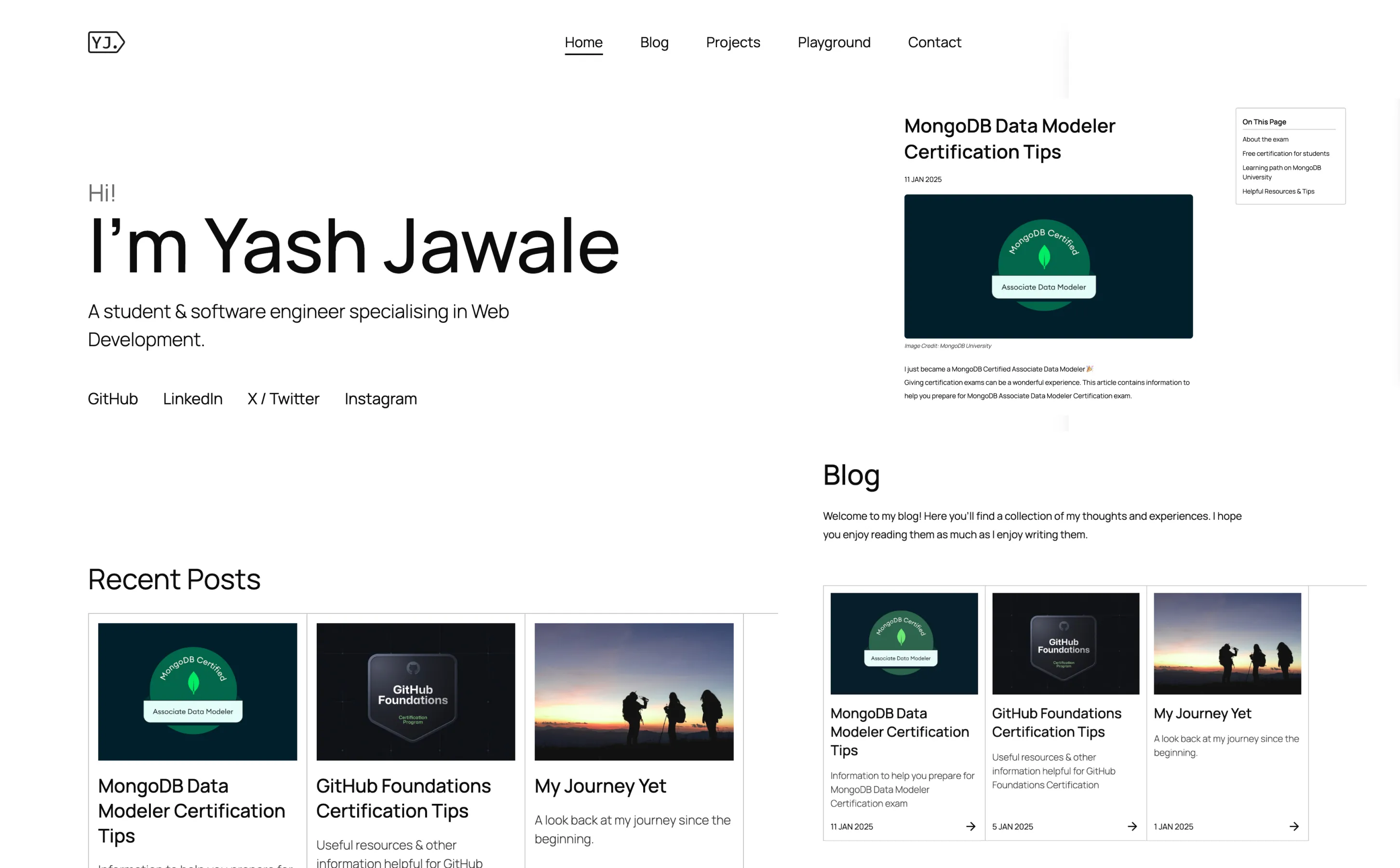
Now I created that exact thing & stuck with it for a while, later just adding some accent color so that clickable things can be distinguised easily & to lose some of that monotonous look which I still do like but I’ve come to know that many do not appreciate, striking a balance.
I’m sharing all these iterations so that…
- At least some use comes out of that 2nd iteration 🫣
- To show that its fine if you don’t land on something at first, as the internet mostly shows the perfect version of all things, sometimes neglecting the imperfections of daily life 🙂
My instinct in this final iteration was simply to make everything clean, obvious, and easy to click on. I didn’t know it at the time, but this intuitive push for better usability is perfectly captured by a principle known as…
Fitts's Law
The time to acquire a target is a function of the distance to and size of the target.
In this iteration, the buttons and links are in decent size and are placed in easy-to-reach spots. While this was true in the previous iterations too, In a minimal design, these clickable elements are obvious and easy to hit.
Now with these iterations, while the site may have lost the strong personality that it maybe once had… I’m happy knowing that anyone can easily access & digest the information, as it follows the common patterns found in other websites.
This video by Phoebe Yu discussing website funtionality v/s appearance is a good watch on the topic
Now I’m by no means a designer or someone who understands the world of web design well, but I have certainly learned a few things along the way & just maybe, might’ve saved someone a few hours (or in my case, whole iterations XD) in design as we might not always have someone with design knowledge to guide us while making small projects.
Thanks for making it till here & I hope the time spent reading this post was worthwhile. My best wishes to the wonderful marvels you create next 🍀
Last modified: 13 Sep 2025